

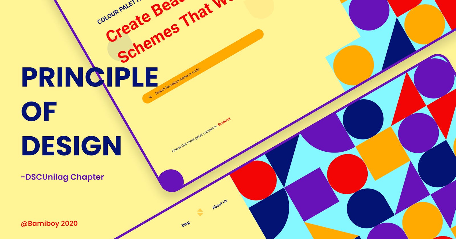


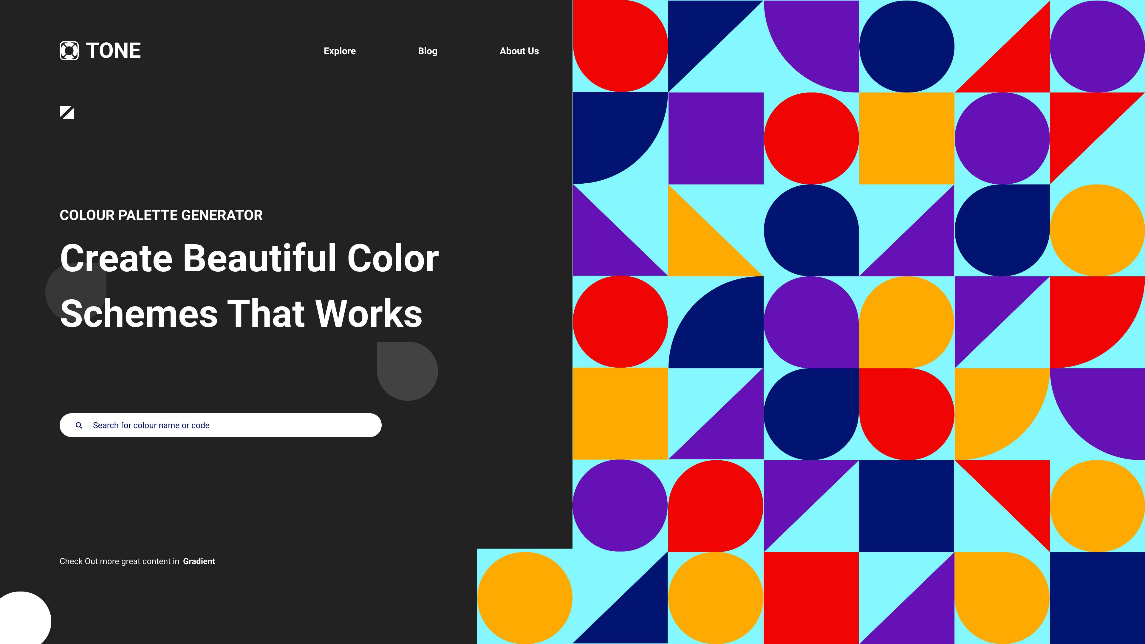
As a UI Designer, I realized that it is good to have a certain number of principles that you apply to your work. This week, I was taught the principles and elements of deign by the DSCUnilag Tutor, Khadijah. She talked on the basic principles of design. She gave out useful resources for us to learn more from. So here is my thought on what I have learnt so far;
"Art and design differ in the way that design always has a purpose."
Principles of Design
The principles of design combines the elements to create a composition, they are the guidelines used to arrange the elements. Each principle is a concept used to organize or arrange the structural elements of a design and it applies to each element of a composition and to the composition as a whole. We can say that the basic Design Principles are composed by;
- Balance
- Emphasis
- Movements
- Pattern
- Repetition
- Proportion
- Rhythm
- Variety
- Unity
Element of Design
The elements of design are the building blocks used by the designers to create the designs. They are the parts, components that can be isolated and defined in any visual design, they are the structure of the work, the objects to be arranged and used as part of any composition. We can say that the general Design Elements are composed by;
- Points
- Line
- Shape
- Form
- Color
- Value
- Texture
- Space
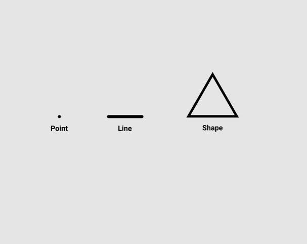
#1 Point, Line and Shape
These are the most basic building blocks of any design, no matter what it is. With these you can create anything you want, from simple icons to very complex illustrations, everything is made with the combination of these simple elements. Connecting Points together forms a Line and Connecting lines together gives a Shape.
#2 Color
Color is the spectral composition of visible light. The human eye can see over 10 million different colors from red to violet, and from young age all of us learn to attribute certain values or meanings to specific colors.
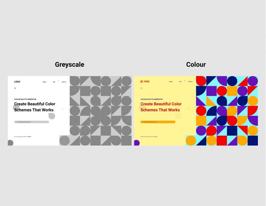 LHS shows the grayscale while RHS shows when it is colored
#3 Space
White Space (also Negative space) looks at the things that does not include any design elements. It creates room for a design to breathe, creates hierarchy and organization and emphasizes the things that make out the design. Space can be powerful and help your viewer to navigate through your design. It can also be a place to rest the eyes. Space is, effectively, empty.
 The black color denotes the white space in the design
#4 Balance
The way these elements are laid out on a page should create a feeling of balance. There are two basic types of balance: Symmetrical and Asymmetrical. Symmetrical designs layout elements of equal weight on either side of an imaginary center line. Asymmetrical balance uses elements of differing weights, often laid out in relation to a line that is not centered within the overall design.
 This design is a symmetrical design
#5 Emphasis
Emphasis deals with the parts of a design that are meant to stand out. In most cases, this means the most important information the design is meant to convey. Emphasis can also be used to reduce the impact of certain information. Tiny typography tucked away at the bottom of a page carries much less weight than almost anything else in design, and is therefore de-emphasized.
#6 Repetition and Pattern
Repetition is a great way to reinforce an idea. It’s also a great way to unify and strengthen a design that brings together a lot of different elements. A Pattern consists of one or several individual elements being repeated a number of times while following a certain set of rules.
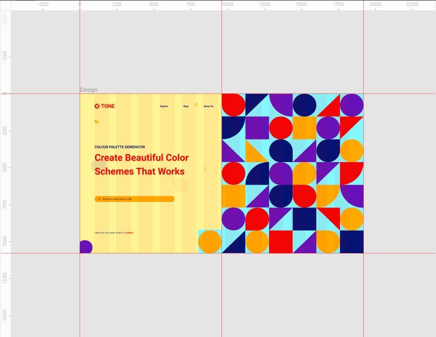
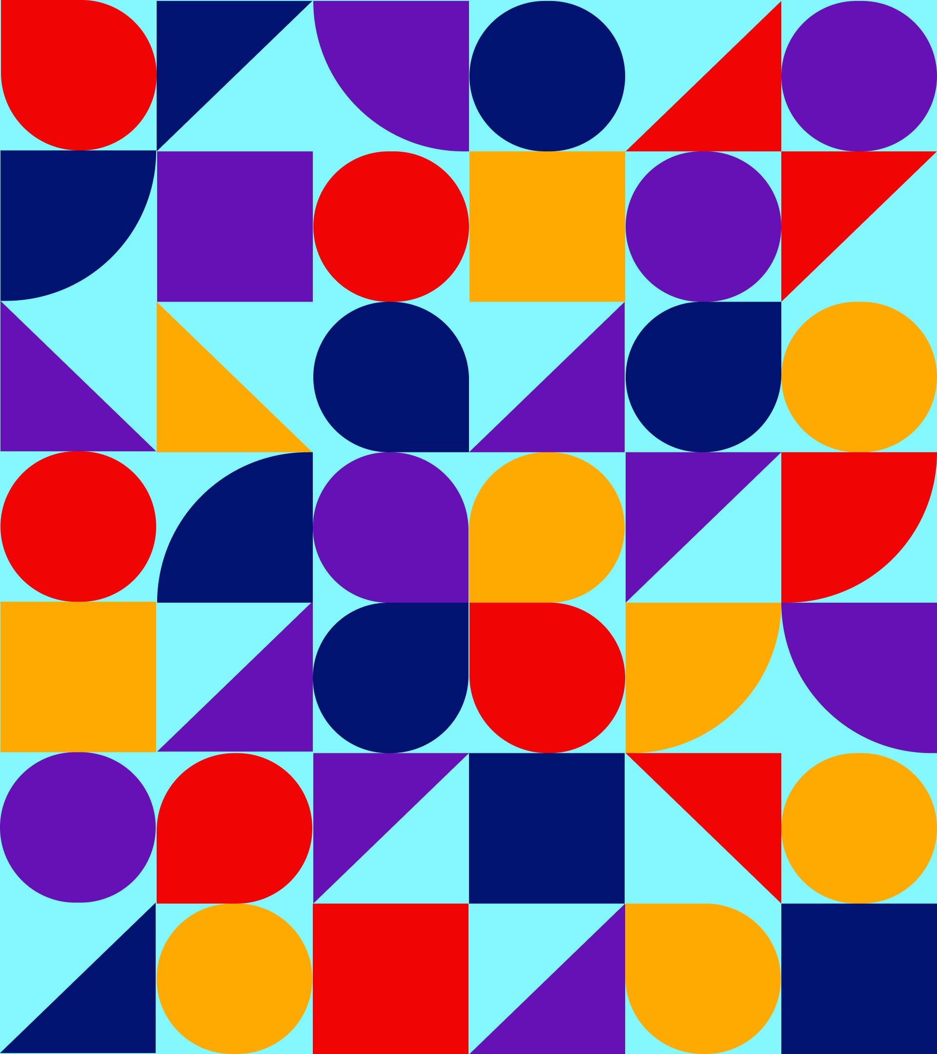 Repetition of geometric shapes
#7 Proportion and Hierarchy
Proportion deals with the visual size and weight of elements in a composition and their relationship with one another. Proportion signals what’s important in a design and what isn’t. Hierarchy is another principle of design that directly relates to how well content can be processed by people using a website. It refers to the importance of elements within a design. The most important elements (or content) should appear to be the most important. Headings and subheadings should be formatted in a way that shows their importance in relation to each other as well as in relation to the title and body copy.
Larger elements are more important, Smaller elements less.
 Hierarchy in typography
#8 Contrast
Contrast creates space and difference between elements in an artwork. It is especially important when it comes to the relationship between the background and foreground and what part of the design will get categorized in which one of them. Contrast is also a very important aspect of creating an accessible design. Insufficient contrast in typography will be very difficult to read. The Contrast in colors have a strong visual effect between black and white, between dark and bright, shadow and light, especially for people with visual impairments.
#9 Unity
Unity refers to how well the elements of design work together. Visual elements should have clear relationships with each other in a design. Unity also helps ensure concepts are being communicated in a clear, cohesive fashion. Designs with good unity also appear to be more organized and of higher quality and authority than designs with poor unity.
Citation: